Deeper Dive Into the Jobs Report: Labor Force Participation and Weekly Earnings
Posted: 03/08/2013 5:11 pm
Jared Bernstein
Today's jobs report is widely being viewed as a sign of an improving job market, a view I share with (of course) caveats. The biggest question is, as I noted earlier, whether the recent acceleration of payroll growth sticks, especially as the sequester takes hold, which it hasn't yet. So far, both the stock and the job markets have said "sequester?...what's a sequester?"
A few things jumped out at me that you might find interesting.
Labor Force Participation: First, there's the tick down in the labor force participation rate, explaining part of the decline in unemployment and one of not-so-bright parts of the report. I've heard some commentators suggest that this is due to unemployed people giving up and dropping out of the job market (remember, you're not counted as unemployed if you've given up looking).
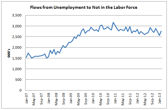
But the data show that not to be the case. The BLS -- and yes, I'll admit it, I love the BLS -- publishes data on flows in and out of the labor force, and the figure below shows the monthly trend from unemployed to NILF (not in labor force). It's a jumpy series, but it clearly went up a lot in the heart of the recession but has flattened and drifted down since (though it ticked up last
month).
So why is the labor participation rate (LFPR) stuck in the tank, or slightly more technically, about 2.5 points below its per-recession peak (Dec07-Feb13)? Certainly, weak labor demand is the big story. But it's not the only factor at play -- research has attributed one-quarter to one-third of the decline to older workers leaving the workforce, presumably for retirement.
The flows data can also be used to decompose this decline in the LFPR between five flows (in order of the bars of the figure):
-not in labor force to labor force
-employed to employed (kept working)
-unemployed to unemployed (kept looking for work)
-un to emp and emp to un
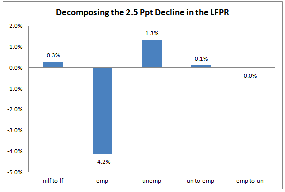
By far the largest of these shares at any point in time is people who kept working and the drop in this share more than explains the decline, consistent with cyclical job losses driving the rate down. As unemployment is still elevated, the unemployed share of the labor force goes up, which is why the un-to-un bar is a positive factor. Interestingly, over this period flows from NILF into the labor force have actually boosted the participation rate a bit.
Weekly Earnings: With both weekly hours and hourly wages up last month, weekly earnings got a nice 0.5 percent bump last month -- that's before inflation, btw. On an annualized basis, that just below 6 percent, so a nice pace if it can be sustained. But don't go popping corks yet -- paychecks haven't caught up with the stock market.
The figure below shows the nominal year-over-year growth in weekly earnings, a better way to suss out the trend. Their growth got slammed in the heart of the downturn -- an hours' story more than an hourly wage one -- but climbed back when jobs and hours began to expand. But they're been trending down
since.
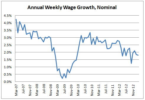
Inflation has been running low, thankfully, below 2 percent in recent months, so in real terms weekly earnings have been flat. But remember, this is the average, combining high-wage workers with low-wage ones. The latter face higher unemployment and have seen worse wage outcomes relative to higher earners.
So, yes -- a pretty solid jobs report with a decent payroll number. But unemployment is still high, the LFPR shows evidence of continued weak demand, and that's taking its toll on wage growth. We'll need a lot more months like this to get back on track.
This post originally appeared at Jared Bernstein's On The Economy blog.
No comments:
Post a Comment