13 NOV 30 2012, 11:17 AM ETPartisan lines that once fell along regional borders can increasingly be found at the county level. What does that mean for the future of the United States?
Starting before the Civil War era, America's political dividing lines were drawn along state and regional borders. Cities and the then-extensive rural areas shared a worldview North and South of the Mason-Dixon line. While there was always tension within states, they were bound by a common politics. The city of Charleston, for example, was as rabidly anti-North as some inland plantation areas. Economic engines, ways of life, and moral philosophies changed at the 36th parallel, where the North began.
Today, that divide has vanished. The new political divide is a stark division between cities and what remains of the countryside. Not just some cities and some rural areas, either -- virtually every major city (100,000-plus population) in the United States of America has a different outlook from the less populous areas that are closest to it. The difference is no longer about where people live, it's about how people live: in spread-out, open, low-density privacy -- or amid rough-and-tumble, in-your-face population density and diverse communities that enforce a lower-common denominator of tolerance among inhabitants.
The voting data suggest that people don't make cities liberal -- cities make people liberal. Here, courtesy of Princeton's Robert Vanderbai, is an electoral map that captures the divisions:

The only major cities that voted Republican in the 2012 presidential election were Phoenix, Oklahoma City, Fort Worth, and Salt Lake City. With its dominant Mormon population, Mitt Romney was a lock in the Utah capital; Phoenix nearly voted for Obama. After that, the largest urban centers to tilt Republican included Wichita, Lincoln, Neb., and Boise.
The gap is so stark that some of America's bluest cities are located in its reddest states. Every one of Texas' major cities -- Austin, Dallas, Houston, and San Antonio -- voted Democratic in 2012, the second consecutive presidential election in which they've done so. Other red-state cities that tipped blue include Atlanta, Indianapolis, New Orleans, Birmingham, Tucson, Little Rock, and Charleston, S.C. -- ironically, the site of the first battle of the Civil War. In states like Nevada, the only blue districts are often also the only cities, like Reno and Las Vegas.
Because winning a state's electoral votes requires only a simple majority, a single city can change the entire game. Blue cities in swing states that ended up going for Obama last Tuesday include Las Vegas, Philadelphia, Pittsburgh, Denver, the cities of Florida, and the cities of Ohio.
Though not generally considered a swing state, Michigan (with 16 electoral votes) was virtually carried by the Detroit metropolitan area, spread across three counties, and a scrap of Flint. Almost the entire rest of the state went different shades of red.
This divide between blue city and red countryside has been growing for some time. Since 1984, more and more of America's major cities have voted blue each year, culminating in 2012, when 27 out of the nation's 30 most populous cities voted Democratic. According to Dave Leip's Atlas of U.S. Presidential Elections and The New York Times, the 2012 election marked the fourth time in the last five federal election cycles that voters shifted away from the party of the sitting president. Despite that constant churn, one part of the electoral map has become a crystal clear constant. Cities, year by year, have become drenched in more blue. Everywhere else is that much more red.
Comparing the state-by-state electoral maps between the election of George W. Bush in 2000 and Obama's reelection, there are considerable differences. But if you look instead at the county-by-county map, the picture changes. The same poles -- the coastal megalopolises, industrial Midwest, and Mississippi River and New South cities -- have fortified the base of Democratic support for 20 years. Republicans have consolidated themselves in the Mountain West, prairie heartland, and Bible Belt.
Between 2000 and 2004 the maps barely seem to change at all. Some counties, for instance, remain the only blue counties in the entire state, year after year. Even comparing 2004 and 2008, many of the most dramatic differences are simply in the margin of victory in various districts. Mushrooming Democratic popularity during the Clinton years and in 2008, while impressive, largely lights up along the periphery of the current Democratic spine.
For years, this continues: Urban and rural counties jostling with a small pool of counties which go back and forth every couple of elections. There's no real realignment, just a constant tug of war as the nation grows further divided.
Electoral cartograms by University of Michigan physics professor Mark Newman show the power of Democratic counties based on population density. Spreading each vote out, his illustrations portray the hidden truth of the conventional electoral map, and why but the much smaller number of dedicated blue counties is outmatching the more geographically numerous red counties.

But this also skirts the point. Cities are significant not just because of their physical locations, but their physical environment. This map of emerging "megaregions" in the U.S. matches up snugly with the blue spots on the electoral map:

In due course, these populous bastions of urban liberalism have helped spur state legislation and court rulings to create new laws, such as those permitting same sex marriage, that are often in direct conflict with federal laws and with the majority of fellow state counties. These measures are not always controversial -- such as Missouri's 2010 Prop B, regulating dog breeding shows -- but the divisions are often stark: cities vs. everywhere else. Meanwhile, the states with constitutional amendments banning gay marriage are often among the least densely populated in the country, such as South Dakota and Idaho.
On Election Day, voters in 37 states weighed in on 174 ballot measures, according to the National Conference of State Legislatures, on matters ranging from gambling to marijuana to the death penalty. It was the second-highest number ever, and this cycle also saw a definitive jump in votes on whether to overturn recently passed legislation, including Obamacare and gay marriage. These state laws are the foundation for potential future federal laws, but the sudden, radical divergence between laws from state to state is leading to a dizzying decentralization, with laws of varying importance in varying directions in varying states checkering the United States. This pre-election graphic demonstrates the complexity of the legal environment for same-sex unions alone across America:

After this year's election, roughly half of the 50 states allow the practice of one, more, or all of the following: same-sex marriage, marijuana use or assisted suicide. Voters in Alabama, Missouri, Montana, and Wyoming passed largely symbolic laws that would prohibit Obamacare, effectively another lifestyle law. Meanwhile, all of the states that voted against Obamacare also ban both same-sex marriage and marijuana use. In Montana, the government won't help insure your health, but it will assist you in killing yourself. Many Americans live in states where they are forced to buy health insurance but are not allowed to end their own lives or marry the person they love.
Federalism's dance is America's great helix, and in due course a new national consensus will tend to emerge. But things might get more divided before they get better. Immediately after the election, more than a 100,000 citizens in more than 20 states signed petitions on the White House websiterequesting to secede from the nation.
That has spurred some pundits to worry about a new splintering like the one 150 years ago and to bemoan, as they do each election year, how the country is growing more divided. But the new divisions don't break down neatly enough between states -- as opposed to within them -- to make the idea of any given state pulling out of the union anything more than minority grousing. Robert Forbes, an antebellum history professor at the University of Connecticut, says fears of a divided America are overblown.
"Compared to the United States of 1860," Forbes says, "the America of 2012 is more like the United Colors of Benetton."
Maps of the 2012 US presidential election results
Email: Thanks to everyone who wrote in about the maps. I've received so much email that I may not be able to reply to everyone, but I much appreciate all your comments and suggestions. Many of the things people have been asking about are answered in this list of frequently asked questions.
Election results by state
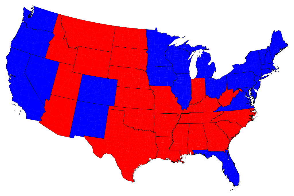
Most of us are, by now, familiar with the maps the TV channels and web sites use to show the results of presidential elections. Here is a typical map of the results of the 2012 election:
Click on any of the maps for a larger picture
The states are colored red or blue to indicate whether a majority of their voters voted for the Republican candidate, Mitt Romney, or the Democratic candidate, Barack Obama, respectively. Looking at this map it gives the impression that the Republican won the election handily, since there is rather more red on the map than there is blue. In fact, however, the reverse is true – it was the Democrats who won the election. The explanation for this apparent paradox, as pointed out by many people, is that the map fails to take account of the population distribution. It fails to allow for the fact that the population of the red states is on average significantly lower than that of the blue ones. The blue may be small in area, but they represent a large number of voters, which is what matters in an election.
We can correct for this by making use of a cartogram, a map in which the sizes of states are rescaled according to their population. That is, states are drawn with size proportional not to their acreage but to the number of their inhabitants, states with more people appearing larger than states with fewer, regardless of their actual area on the ground. On such a map, for example, the state of Rhode Island, with its 1.1 million inhabitants, would appear about twice the size of Wyoming, which has half a million, even though Wyoming has 60 times the acreage of Rhode Island.
Here are the 2012 presidential election results on a population cartogram of this type:
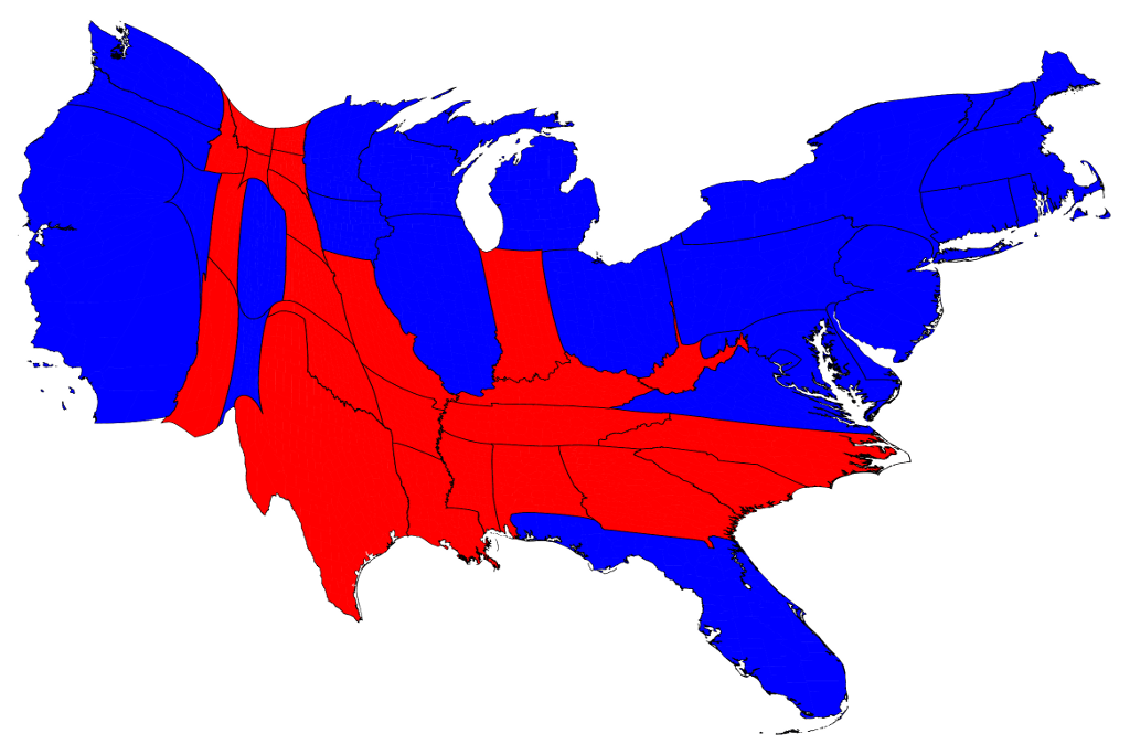
As you can see, the states have been stretched and squashed, some of them substantially, to give them the appropriate sizes, though it's done in such a way as to preserve the general appearance of the map, so far as that's possible. On this map there is now clearly more blue than red.
The presidential election, however, is not actually decided on the basis of the number of people who vote for each candidate but on the basis of the electoral college. Under the US electoral system, each state in the union contributes a certain number of electors to the electoral college, who vote according to the majority in their state. (Exceptions are the states of Maine and Nebraska, which use a different formula that allows them to split their electoral votes between candidates.) The candidate receiving a majority of the votes in the electoral college wins the election. The electors are apportioned among the states roughly according to population, as measured by the census, but with a small but deliberate bias in favor of less populous states.
We can represent the effects of the electoral college by scaling the sizes of states to be proportional to their number of electoral votes, which gives a map that looks like this:

This cartogram looks similar to the one above it, but it's not identical. Wyoming, for instance, has approximately doubled in size, precisely because of the bias in favor of small states.
The areas of red and blue on the cartogram are now proportional to the actual numbers of electoral votes won by each candidate. Thus this map shows at a glance both which states went to which candidate and which candidate won more electoral college votes – something that you cannot tell easily from the normal election-night red and blue map.
Election results by county
But we can go further. We can do the same thing also with the county-level election results and the images are even more striking. Here is a map of US counties, again colored red and blue to indicate Republican and Democratic majorities respectively:
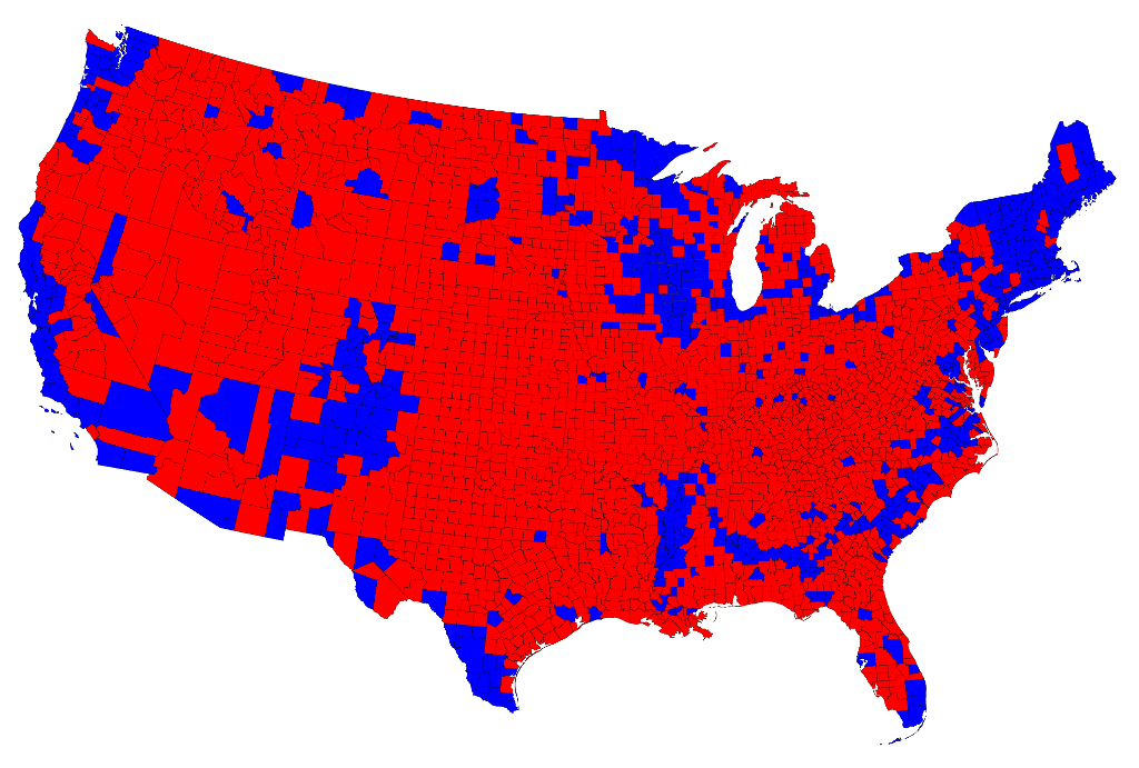
Now the effects we saw at the state level are even more pronounced: the red areas appear overwhelmingly in the majority, an appearance again at odds with the actual results of the election. Again, we can make a more helpful respresentation by using a cartogram. Here is what the cartogram looks like for the county-level election returns:
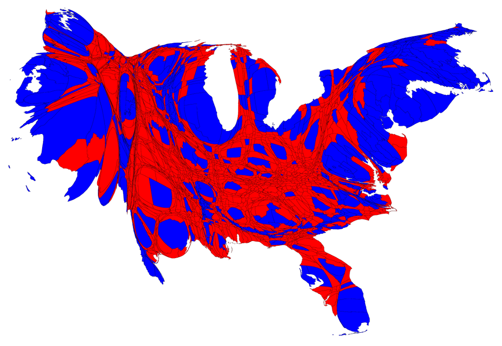
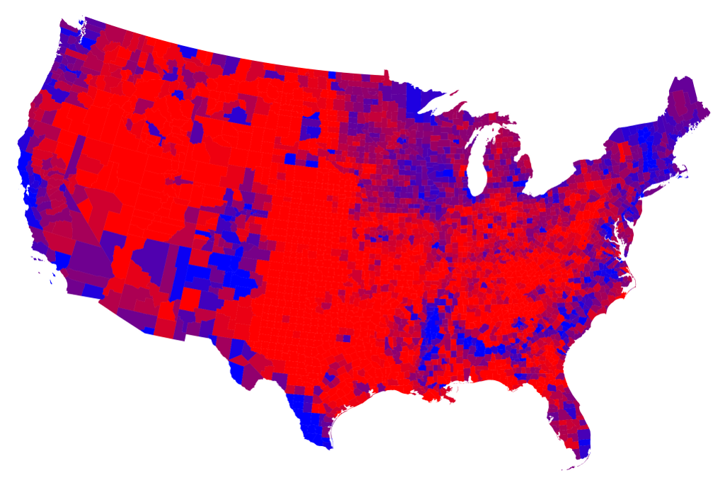
However, this map is still somewhat misleading because we have colored every county either red or blue, as if every voter voted the same way. This is of course not realistic: all counties contain both Republican and Democratic supporters and in using just the two colors on our map we lose any information about the balance between them. There is no way to tell whether a particular county went strongly for one candidate or the other or whether it was relatively evenly split.
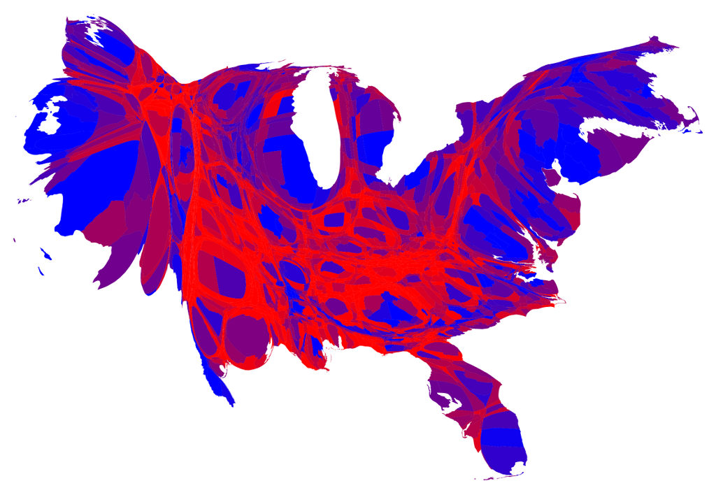
One way to improve the map and reveal more nuance in the vote is to use not just two colors, red and blue, but to use red, blue, and shades of purple in between to indicate percentages of votes. Here is what the normal map looks like if you do this:

And here's what the cartogram looks like:

As this map makes clear, large portions of the country are quite evenly divided, appearing in various shades of purple, although a number of strongly Democratic (blue) areas are visible too, mostly in the larger cities. There are also some strongly Republican areas, but most of them have relatively small populations and hence appear quite small on this map.
A slight variation on the same idea is to use a nonlinear color scale like this:
These maps use a color scale that ranges from red for 70% Republican or more, to blue for 70% Democrat or more. This is sort of practical, since there aren't many counties outside that range anyway, but to some extent it also obscures the true balance of red and blue.
Notes:
Frequently asked questions (FAQs): A list of frequently asked questions concerning these maps, along with answers, can be found here.County results: The county-level data I used came from here. They are, as far as I know, up-to-date as of November 8, 2012, but a small number of precincts still had not reported by that date, so a few results are missing.
Thanks: Thanks to Robert Vanderbei for help with obtaining the county-level data. Professor Vanderbei also suggested the purple maps, and has made a terrific series of maps of his own, which you can find here.
Software: My computer software for producing cartograms is freely available here.
No comments:
Post a Comment